
Create a Set of Web Buttons
In this Graphic for Mac tutorial we will create a set of web buttons. Using the techniques in this tutorial you can quickly create a large variety of button styles and change their appearance easily.
For starters, you will learn how to set up a simple grid. Using the Rounded Rectangle Tool, you will learn how to easily create a pixel-perfect vector shape. Taking full advantage of the Effects pane, you will learn how to add shading and highlights for your button shape.
Moving on, you will learn how to add a simple piece of text and how to stylize it. Finally, you will learn how to easily adjust the style of your button.
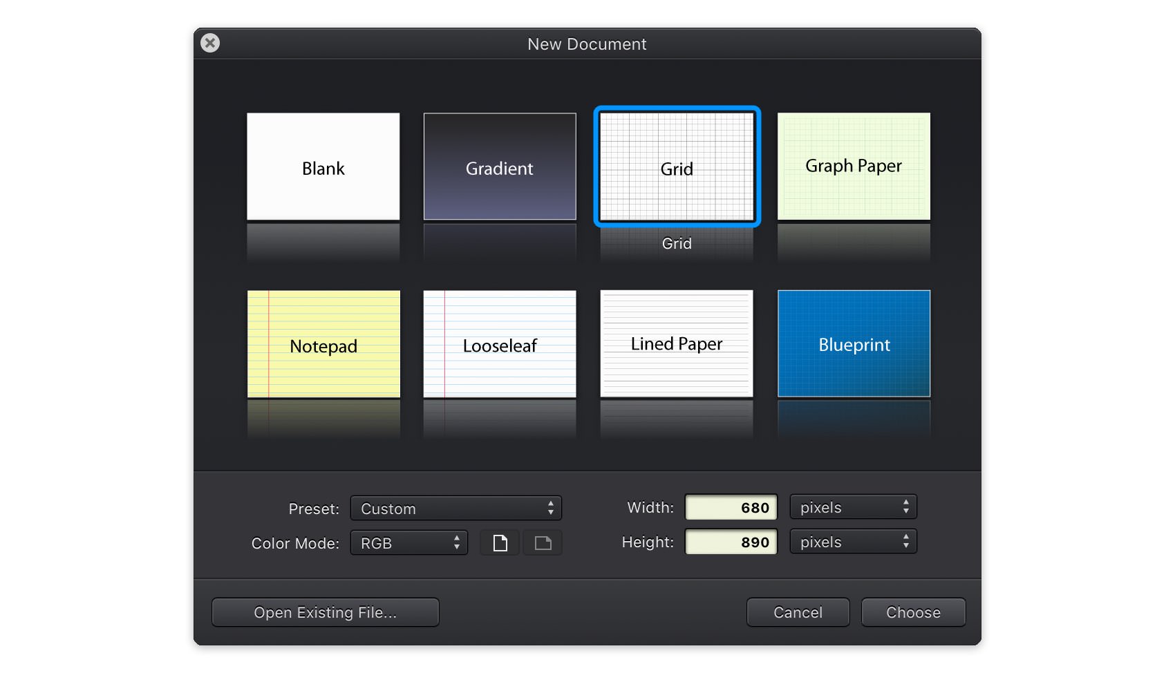
Step 1 - Create a New Document
For this tutorial we'll create a new 680 x 890 pixel document. Choose File > New (Command + N) to bring up the 'New Document' panel. Set the document units to pixels, and the document dimensions to 680 pixels wide by 890 pixels high.
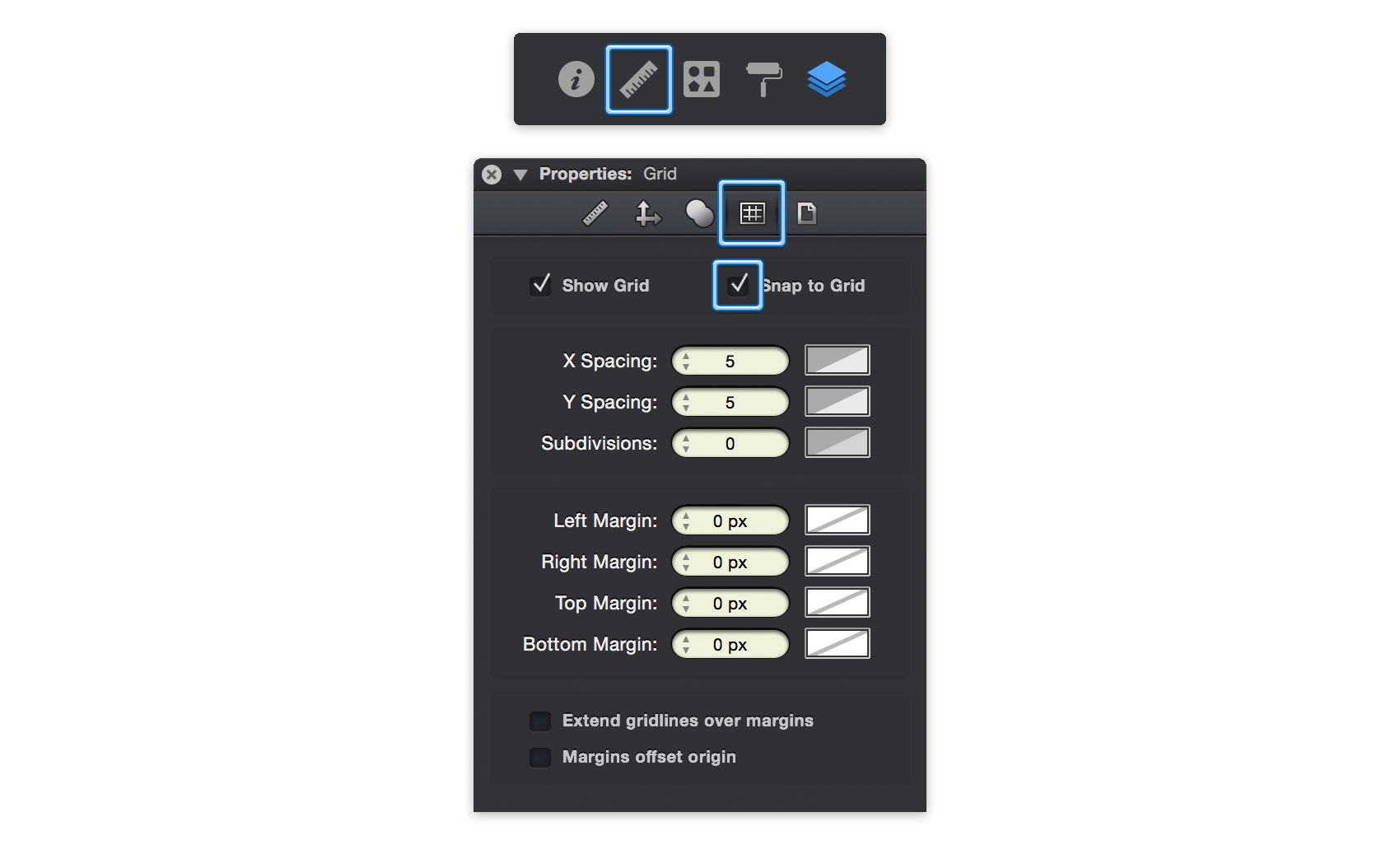
Step 2 - Customize the Grid
To easily create and position uniform button shapes we can first set up our document's grid. Switch to the Grid pane in the Properties panel. Change the X Spacing and Y Spacing to 10 px and enable Snap to Grid (Shift + Command + ').
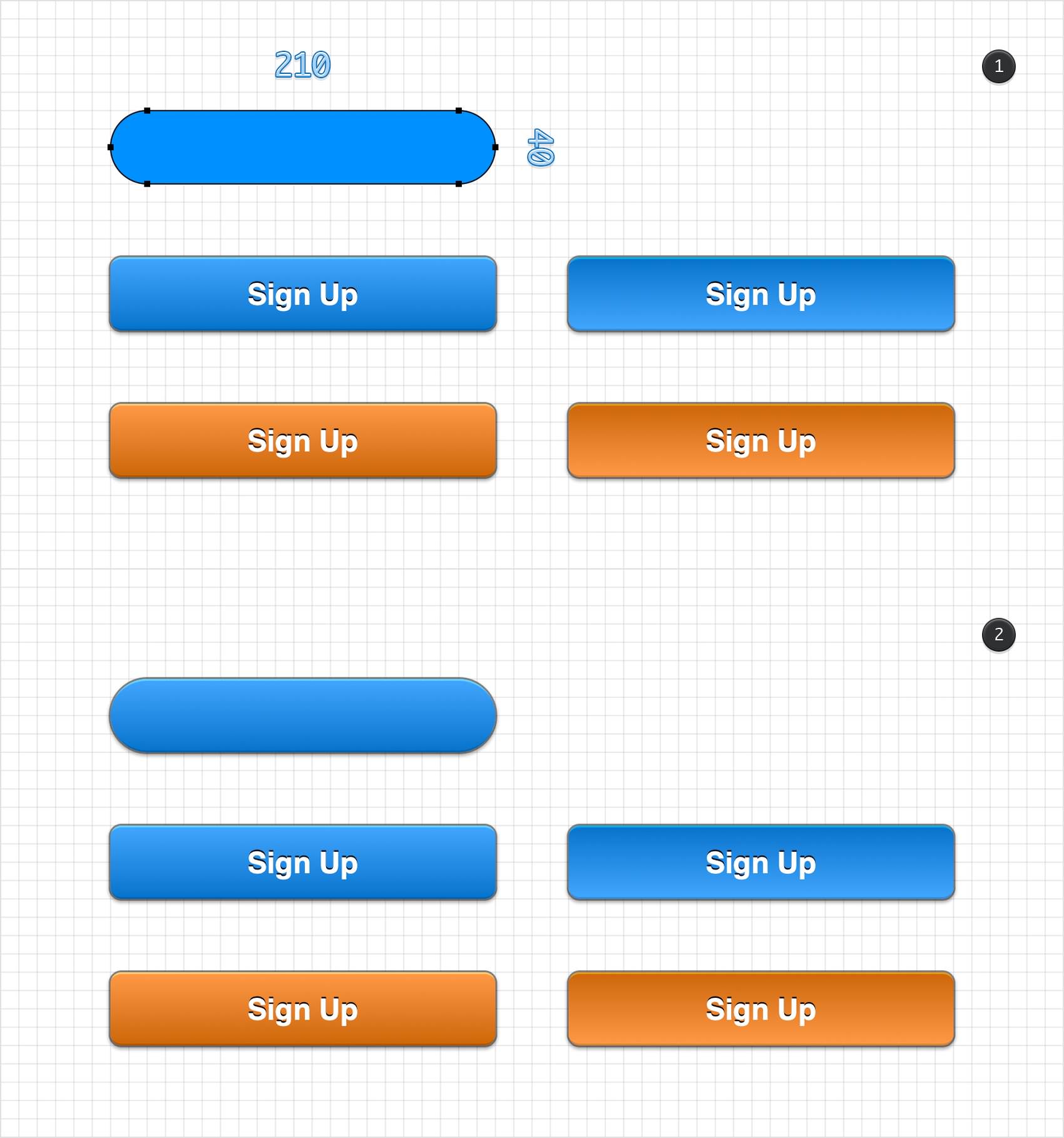
Step 3 - Draw the Button Shape
Select the Rounded Rectangle Tool (Shift-M) from the Toolbar. The Corner Radius used when creating rounded rectangles can be set from the Tool Options bar directly above the canvas area. Set the Corner Radius to 6 pt and draw a rounded rectangle with a width of 210 px and a height of 40 px.
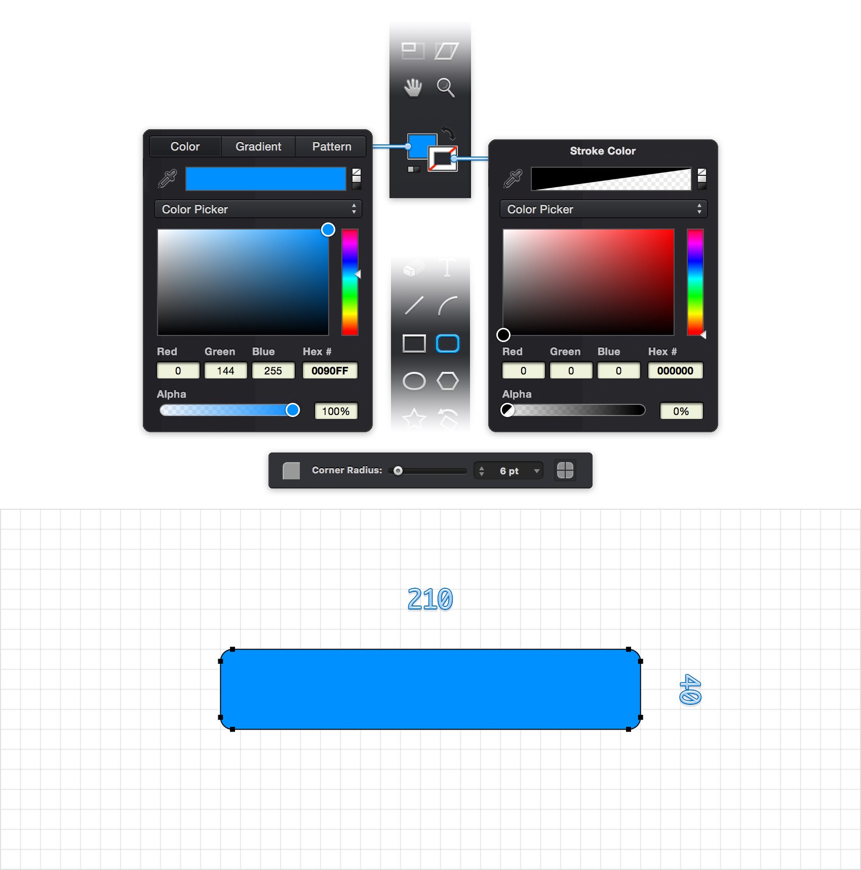
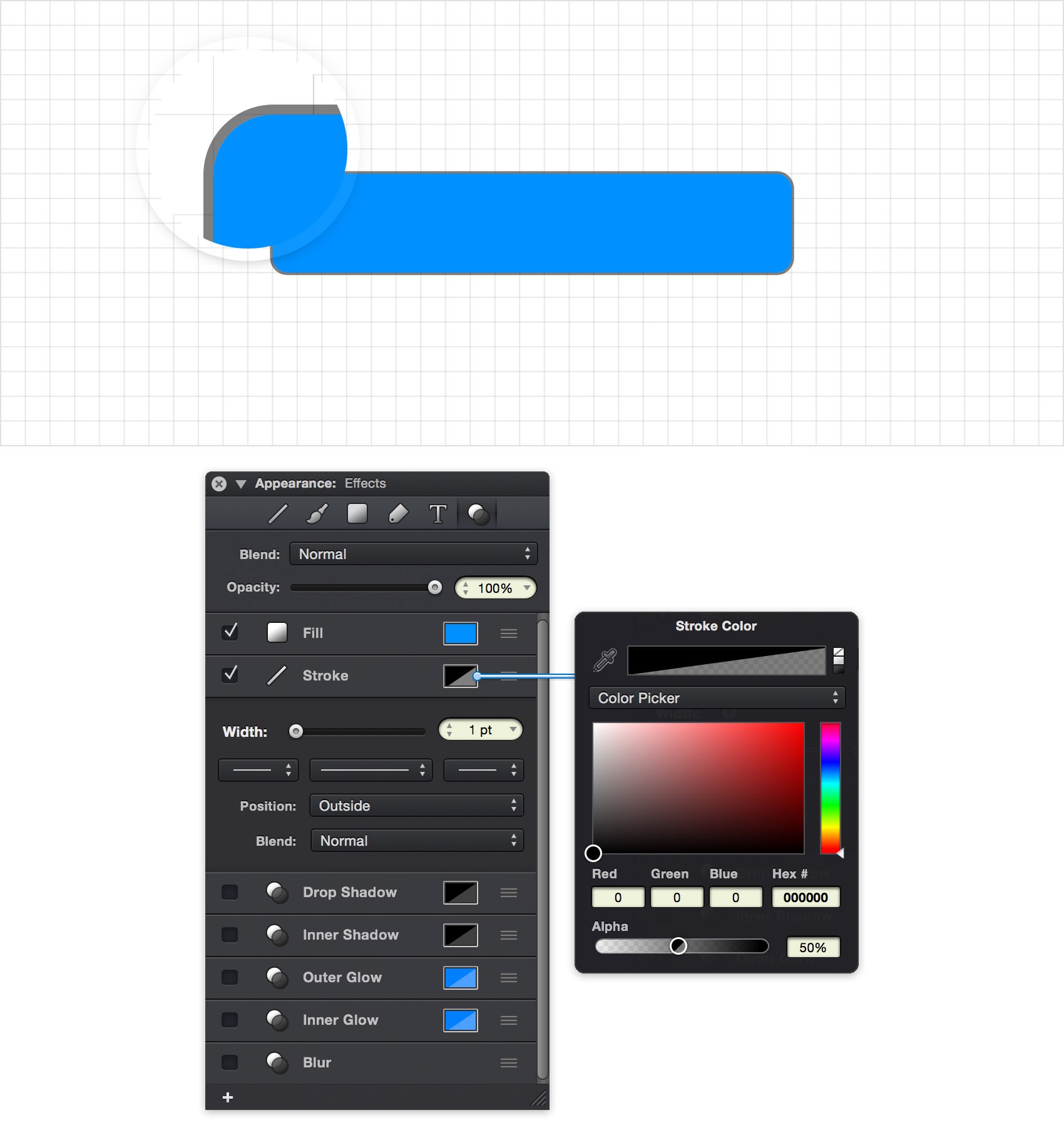
Step 4 - Set the Fill and Stroke Styles
With the rounded rectangle shape selected, switch to the Effects pane in the Appearance panel to customize its ettings. Click on the color well of the Fill item to change the button's fill color. From the RGB color picker, choose R: 0 G: 144 B: 255.
Click on the Stroke color well, change the color black (R: 0 G: 0 B: 0) and drag that Alpha slider to 50%. Next, click on the Stroke item to view and edit the stroke settings. Set the Width to 1 pt and the Position to Outside.
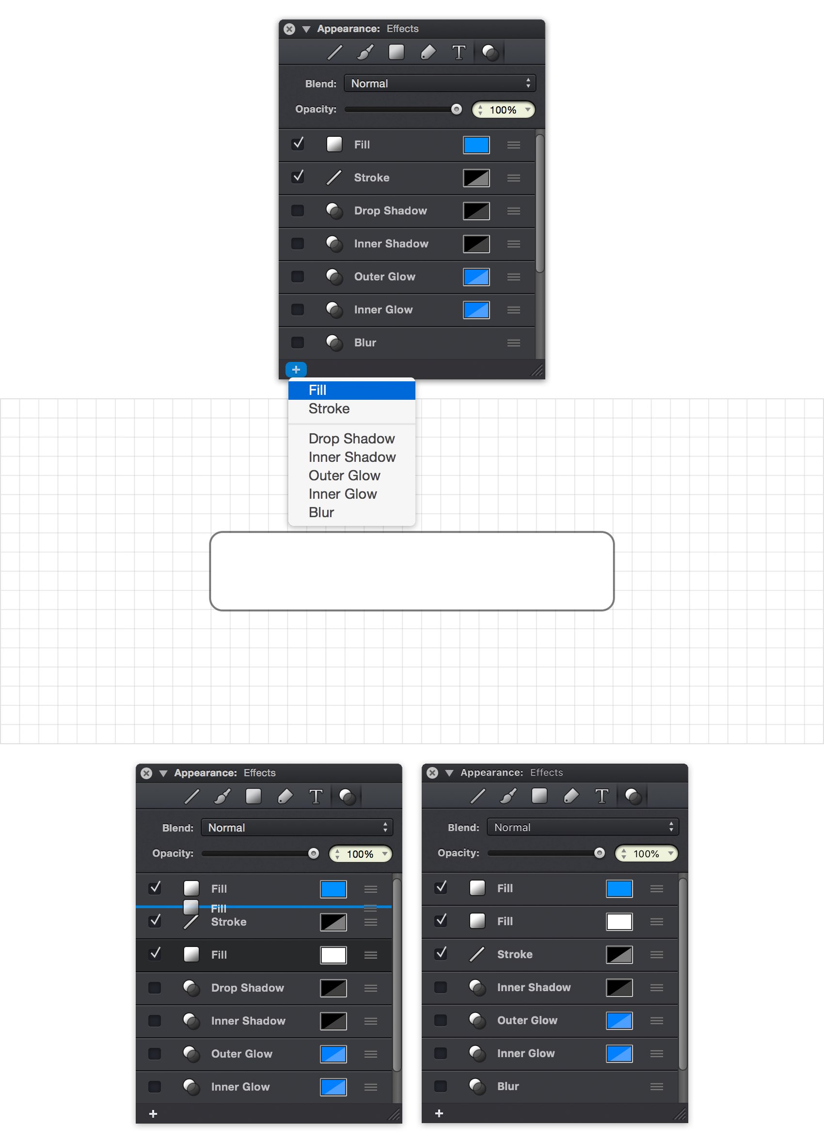
Step 5 - Add a Second Fill
To give the button some depth we're going to add a second fill with a semi-transparent gradient. Click on the plus button at the bottom of the panel and choose 'Fill' from the popup menu to add another fill.
Items in the Effects pane can be easily dragged and droped to re-order them. Drag the new fill item and place it directly under the first fill. This new order will cause the second fill to draw directly after the first fill, rather than after the stroke.
Note: in this case the visual appearance doesn't change since the stroke is positioned outside of the path, however if the stroke was positioned inside or centered the second fill would now appear under the stroke rather than on top of it.
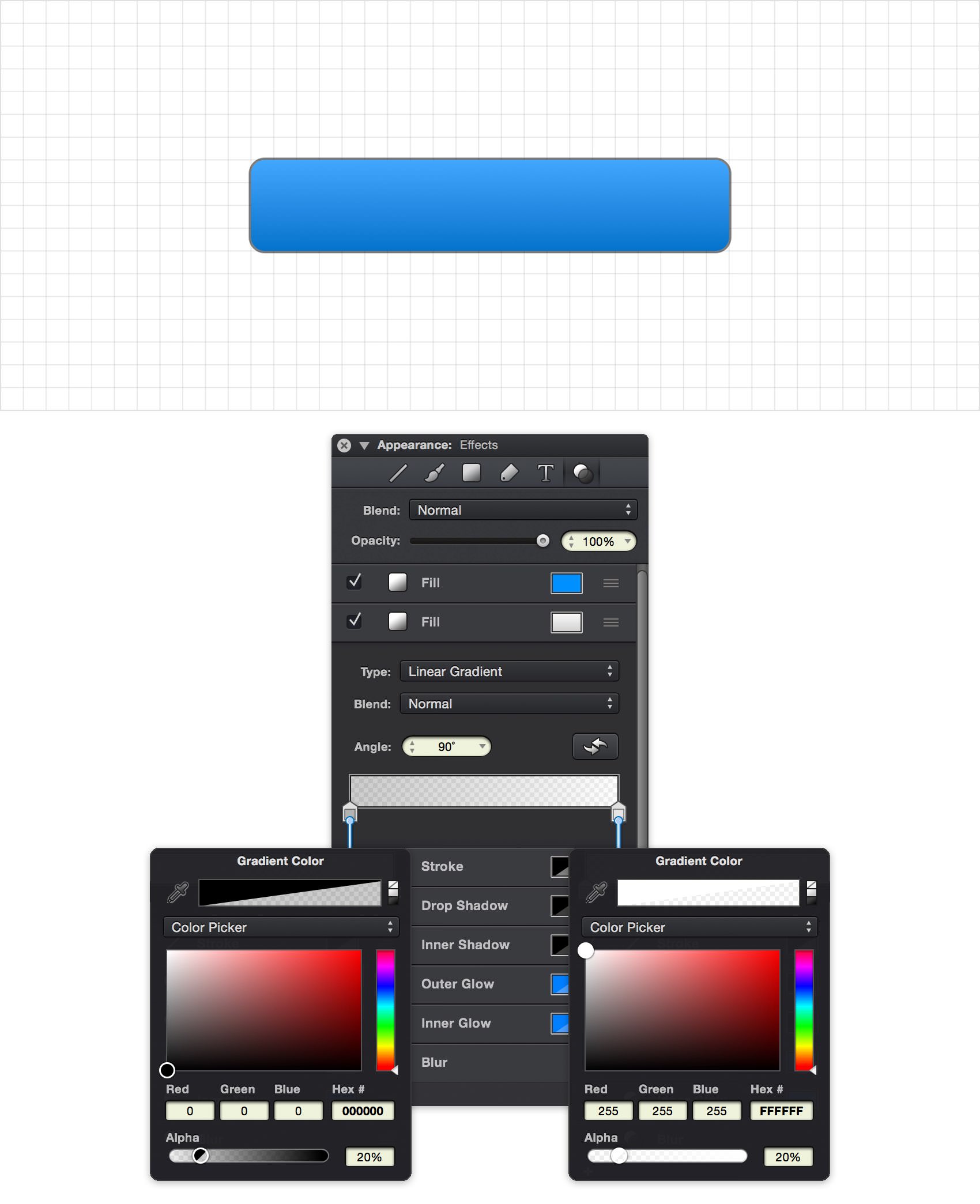
Step 6 - Set the Gradient Fill
To change the second fill to a gradient click on the item in the Effects pane to view its settings and choose Linear Gradient from the Type popup. Change the gradient angle to 90˚ and then focus on the gradient bar. Click the left color stop, set the color to black and drag that Alhpa slider to 20%. Click the right color stop, set the color to white and drag the Alpha slider to 20%.
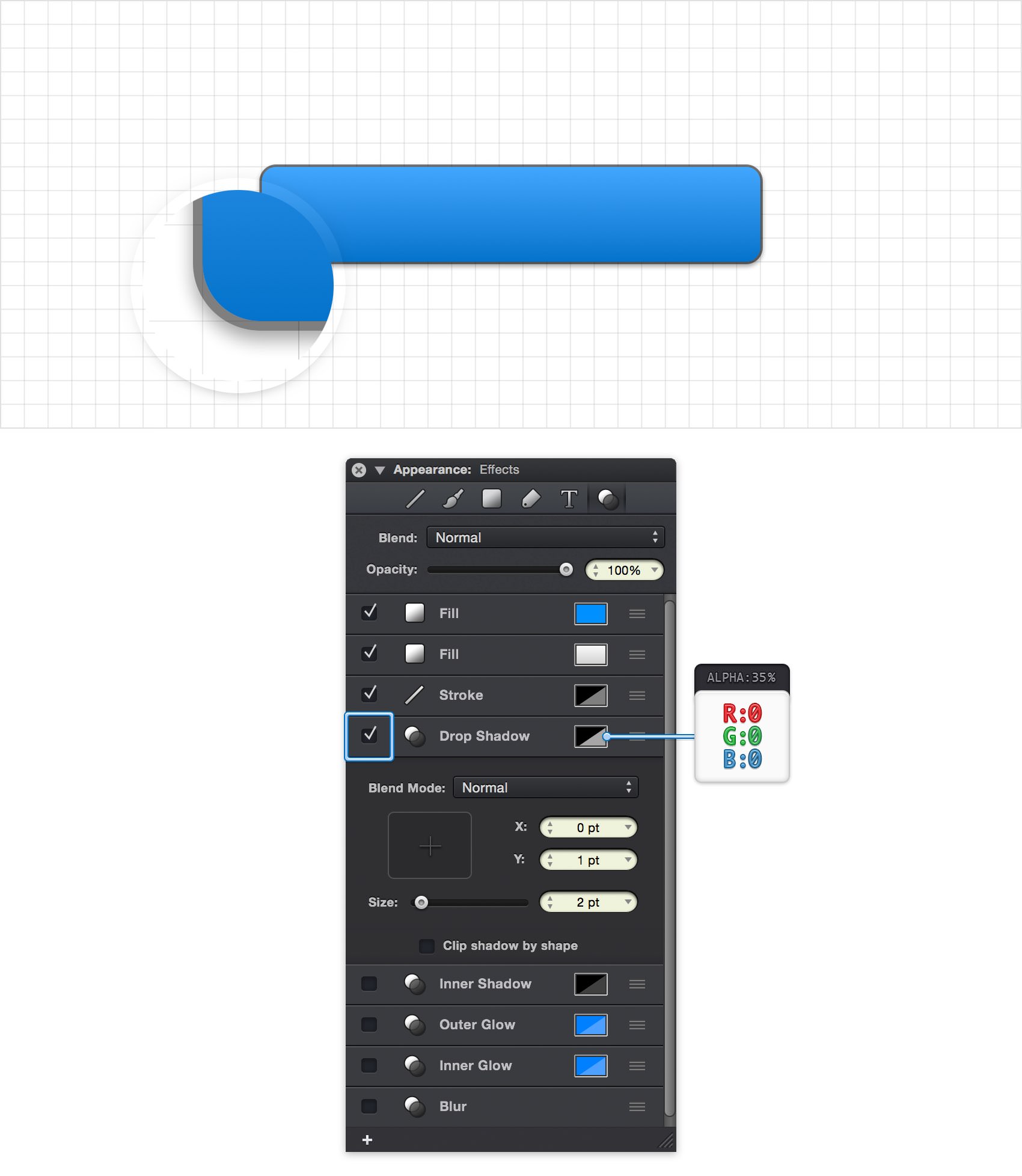
Step 7 - Set a Drop Shadow
Next, we'll add a slight drop shadow to the button. Click the check box next to the Drop Shadow item in Effects pane to enable the effect. Click on the drop shadow's color well, change the color to black and set the Alpha atributes to 35%. Click on the Drop Shadow item to view and edit its settings. Set the offset to X: 0 pt and Y: 1 pt to position the shadow slightly below the button. Drag that Size slider to 2 pt and turn off the 'Clip shadow by shape' setting.
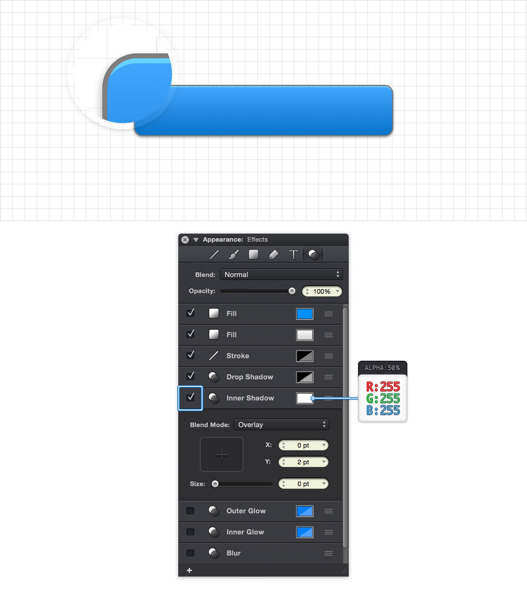
Step 8 - Set the Top Inner Border
To add a highlight at the top of button we're going to use the Inner Shadow effect. Click on the check box next to the Inner Shadow item in Effects pane to enable the effect.
Click on the Inner Shadow's color well, change the color to white and drag that Alpha slider to 50%. From the Inner Shadow's settings pane, set the offset to X: 0 pt and Y: 2 pt and set the Size to 0 pt. Also, set the Blend Mode to Overlay. This will create a solid light-colored line bordering the top of the button.
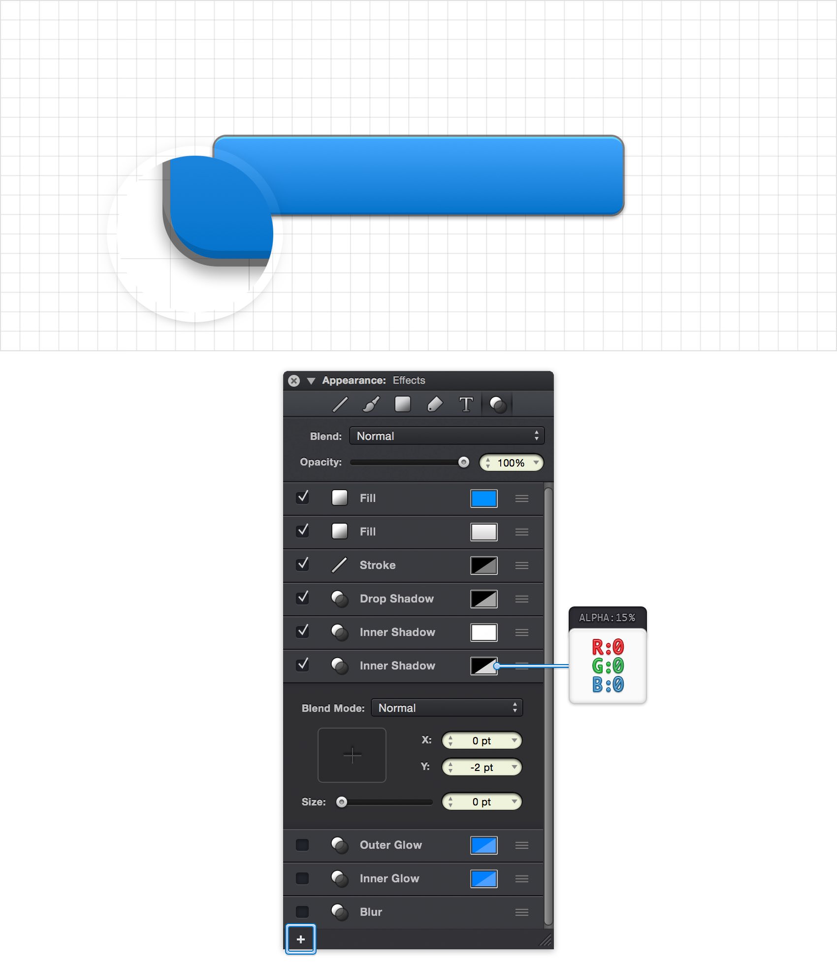
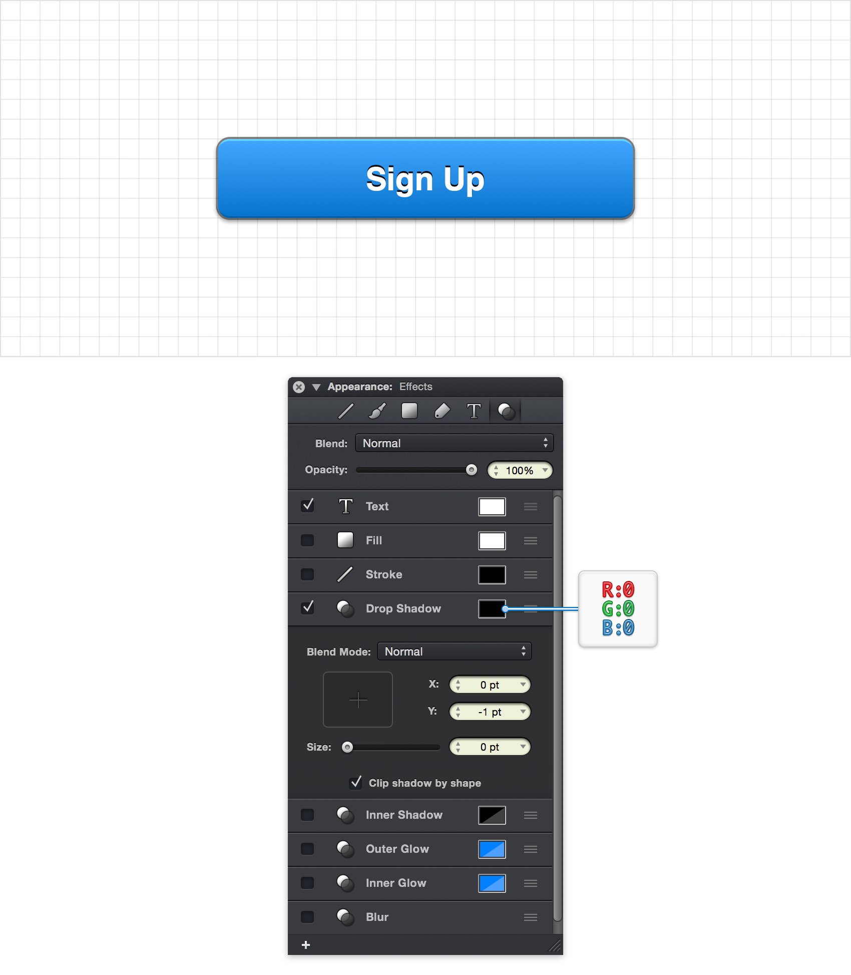
Step 9 - Set the Bottom Inner Border
To create a dark highlight at the bottom of the button we're going to add another Inner Shadow effect and repeat the steps from before. Click on the plus button at the bottom of the panel and choose 'Inner Shadow' from the popup menu to add another Inner Shadow to your button shape.
Click on the Inner Shadow's color well, change the color to black and drag that Alpha slider to 15%. From the Inner Shadow's settings pane, set the offset to X: 0 pt and Y: -2 pt and set the Size to 0 pt. This time we'll keep the Blend Mode set to Normal. This will create a solid dark-colored line bordering the bottom of the button. The screenshot below shows the full effects stack applied to the button.
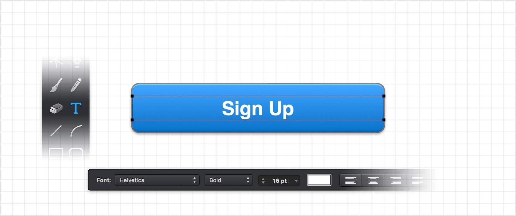
Step 10 - Add the Text Label
Select the Text Tool (T) from the Toolbar and click and drag a text area centered on top of the button. From the Tool Options bar, choose the font Helvetica, change the style to Bold and set the size to 16 pt. Set the text color to white and change the text alignment to centered. Type the button's text in the text area.
Step 11 - Set the Text Shadow
With the text object selected, enable the Drop Shadow effect by clicking on the checkbox next to it in the Effects pane.
Click on the Drop Shadow's color well and change the shadow color to black, R: 0 G: 0 B: 0 A: 100%. Click on the Drop Shadow item to view and edit its settings. Set the offset to X: 0 pt and Y: -1 pt and set the Size to 0 pt.
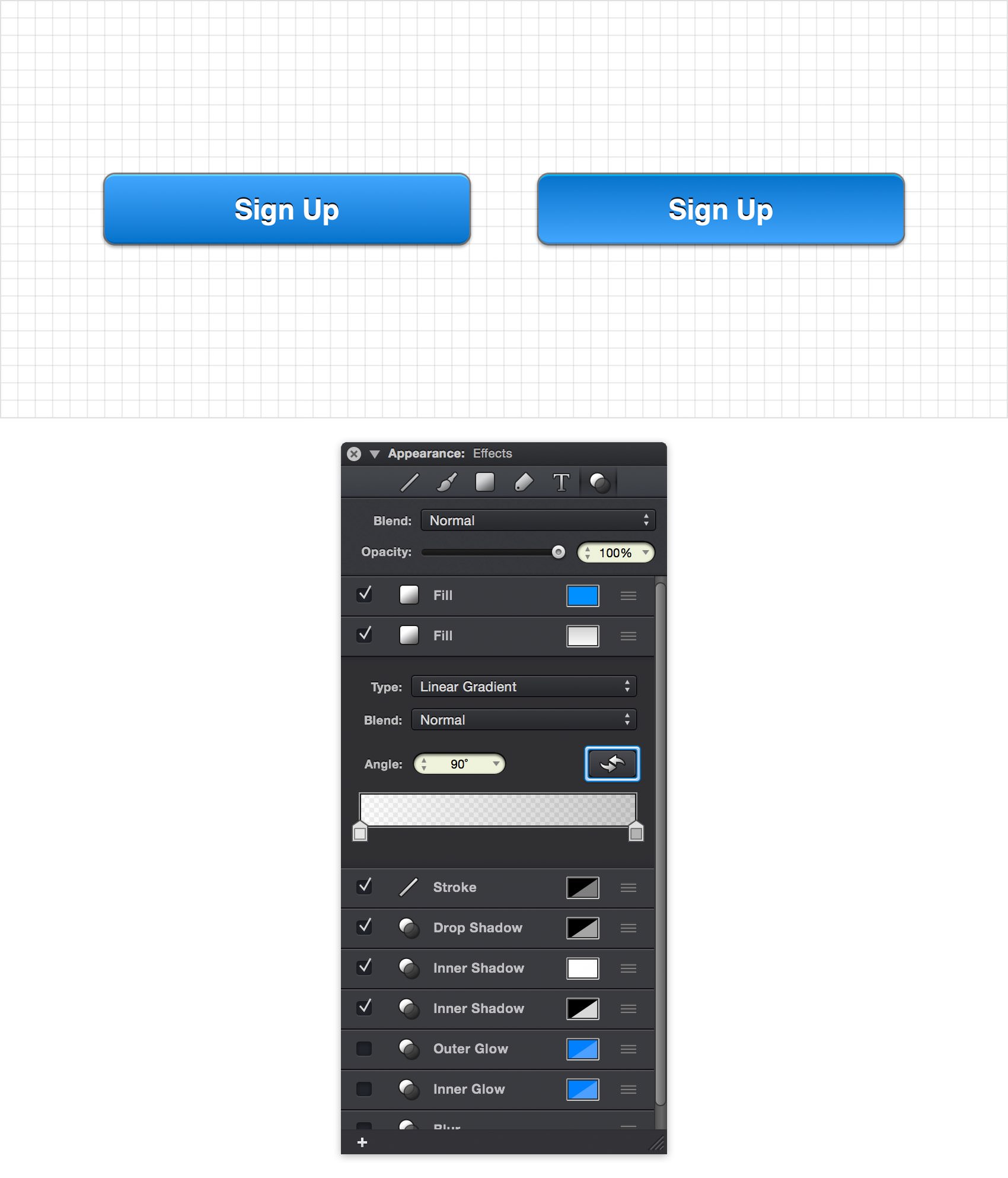
Step 12 - Create the Pressed State Button
Next, we'll create a copy of the button for a pressed state version. Switch to the Move Tool (V) and select both the button and text label using the Shift key, or by dragging a selection area.
You can duplicate the button by using the copy and paste commands (Command + C > Command + V) or by option-dragging the selection.
After duplicating, move the second button next to first. To create the pressed state, now select only the second button's shape (without the text label) and view the gradient fill settings in the Effects pane. Click on the reverse gradient button and voila, a pressed button… it's that easy.
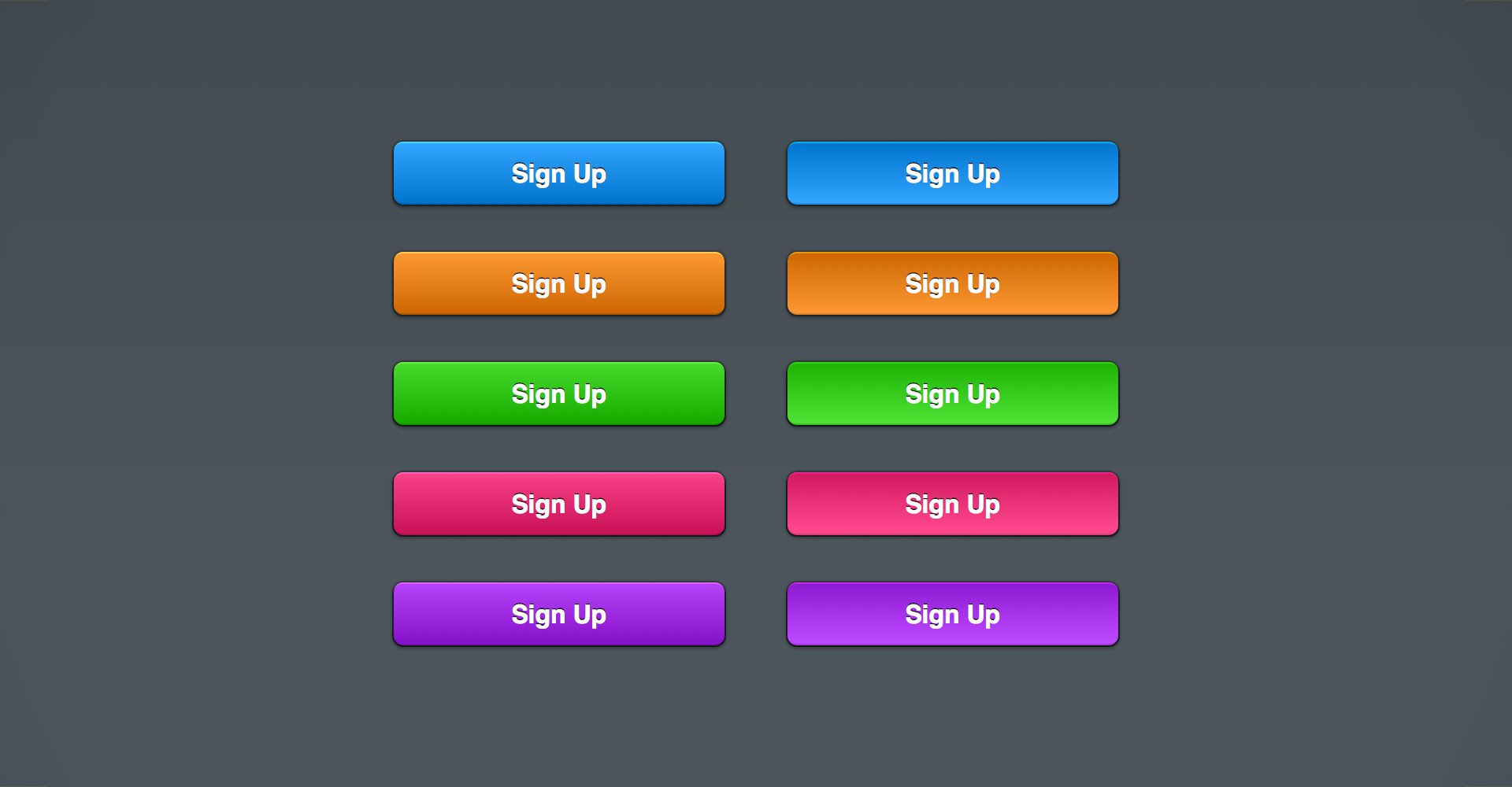
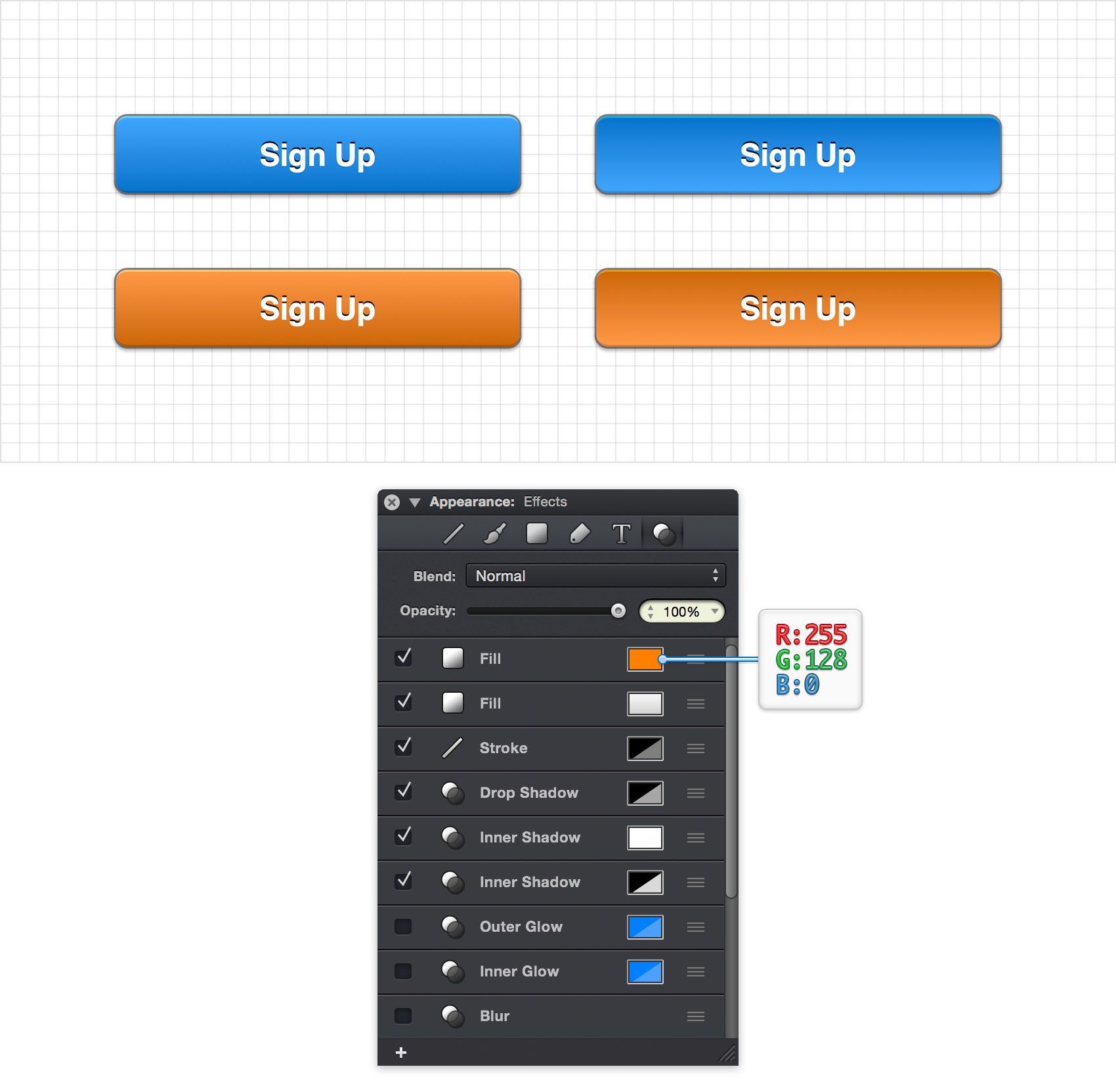
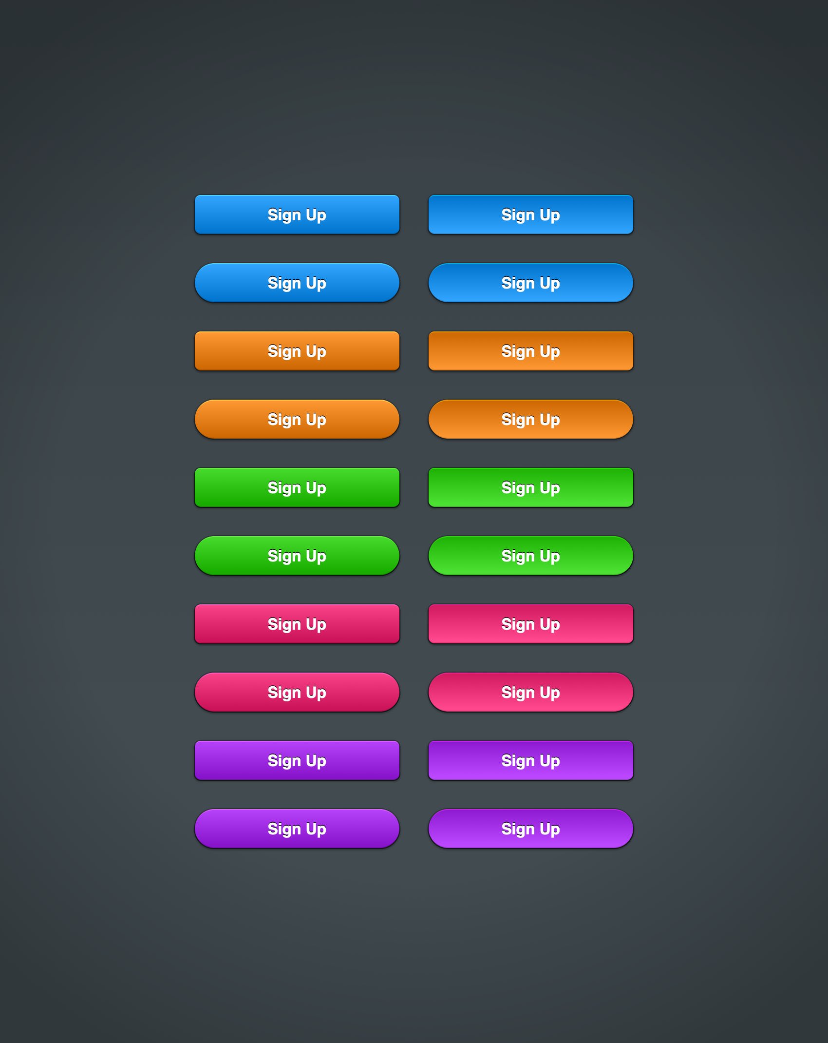
Step 13 - Change Button Colors
Creating alternate versions of our button in different colors is just as easy as creating the pressed state... all we need to do is change one setting, the first Fill color. Since all of the other effects are applied on top of this base color, this is the only setting we need to change to create a variety of different colored buttons.
Step 14 - More Button Shapes
Using the effects stack we've created as a base style, you can create many different types of buttons. For example, using a larger corner radius with the Rounded Rectangle Tool (Shift + M) you can create capsule shaped buttons.
To apply a style from one shape to another shape you can use the Copy Style (Command-Option-C) / Paste Style (Command-Option-V) commands.
Finished Design
Congratulations, you've finished the tutorial!
Hope you've enjoyed learning some of the techniques and processes presented in these steps. As always, feel free to adjust the final design and make it your own.
Download Graphic File:
WebButtons.idraw